You're Being Guided, Not Shopping: The Department Store Blueprint Hidden Inside Every Grocery Run
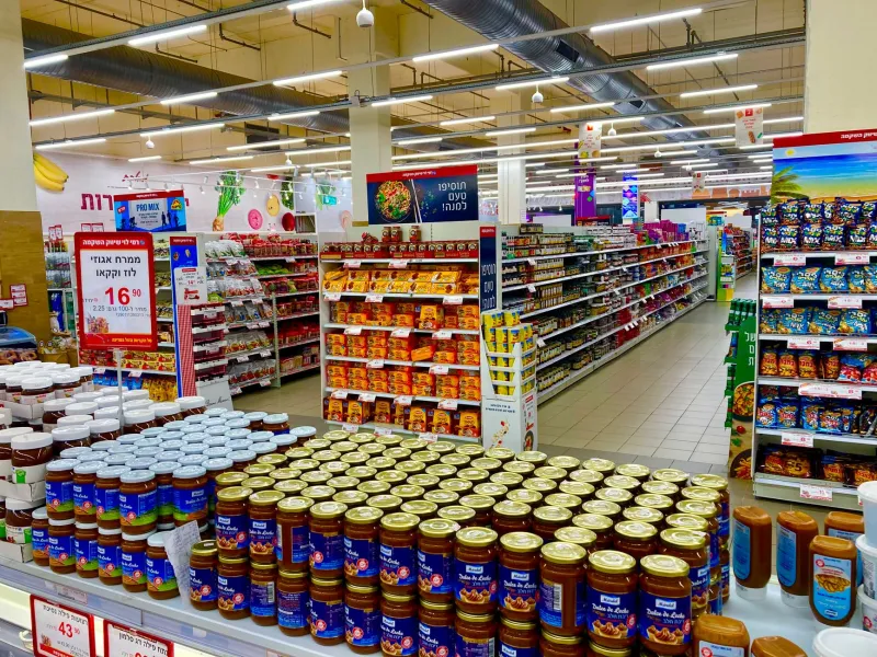
You walk into the grocery store for three things. Milk, bread, eggs. You leave twenty minutes later with a cart that somehow includes granola bars, a magazine, and a scented candle. Nobody forced you. Nobody even asked. But something in that building absolutely nudged you toward every single one of those decisions.
The layout of the modern American supermarket is one of the most quietly powerful psychological tools in everyday life. And almost nobody knows that grocers didn't invent it. They stole it — wholesale — from a completely different industry.
The Problem With Selling Groceries
Before the 1930s, buying food in America was a fragmented, transactional experience. You went to the butcher for meat, the bakery for bread, the produce stand for vegetables. Grocery stores existed, but they were small, cluttered, and largely staffed by clerks who fetched items for you from behind a counter. There was no browsing. There was no wandering. You asked, they handed it over, you paid and left.
Then the supermarket arrived. Clarence Saunders opened Piggly Wiggly in Memphis in 1916, introducing the radical concept of self-service shopping. Customers could now walk the aisles themselves, pick up products, and make their own choices. It was a genuine revolution in retail. But it created an immediate problem: how do you keep people in the store long enough to buy more than they came for?
Grocers needed a design strategy. And they found one in the most unlikely place.
What Woolworth's Already Knew
By the early 1900s, department stores like Woolworth's, Marshall Field's, and Macy's had already spent decades engineering the shopping experience. They weren't selling food. They were selling everything else — fabric, cosmetics, housewares, toys — and they had developed a sophisticated understanding of how physical space could influence purchasing behavior.
Their core insight was deceptively simple: the longer someone stays in a store, the more they spend. So every design decision was made to slow people down, create visual interest, and route customers past as many products as possible before they found what they actually came for.
Woolworth's placed its most eye-catching, colorful merchandise near the entrance to create an immediate emotional lift. Essentials were pushed toward the back. Impulse items — small, cheap, tempting — were positioned near registers where customers were already committed to the act of spending money. The whole building was essentially a slow, pleasant trap.
When supermarket designers in the 1930s and 1940s started thinking seriously about store layout, they looked directly at what department stores had already proven. The principles translated almost perfectly.
Produce at the Door Wasn't About Freshness
One of the most persistent myths about supermarket design is that fresh produce sits near the entrance because it needs to be kept cool or because it's the most perishable. Neither is true. Produce is near the entrance because it's colorful, visually inviting, and emotionally priming.
Research conducted as early as the 1950s showed that customers who encountered fresh fruits and vegetables first were more likely to make generous, feel-good purchases throughout the rest of their trip. Seeing something wholesome and natural at the start of a shopping experience creates a psychological permission slip — you've already done something responsible, so treating yourself to something indulgent later feels balanced.
This was pure Woolworth's logic, applied to food. Lead with what makes the customer feel good about being there.
The Dairy Conspiracy at the Back of the Store
Milk, eggs, and butter are among the most commonly purchased grocery items in America. In almost every major supermarket chain, they are also among the furthest items from the front door.
This is not a coincidence. It is a deliberate routing strategy borrowed directly from the department store model of placing essential goods at the back of the floor plan. If a customer must travel the full length of the store to get something they definitely need, they will pass hundreds of products they didn't plan to buy. Some of those products will end up in the cart.
Sylvan Goldman, the Oklahoma grocer who invented the shopping cart in 1937, understood this implicitly. The cart wasn't just a convenience — it was a capacity expansion. The harder it is to carry things by hand, the sooner you stop shopping. Give someone a rolling basket and suddenly their physical limit disappears. Paired with a layout designed to maximize travel distance, the shopping cart was the engine that powered the department store blueprint in a grocery context.
The Checkout Gauntlet
By the time you reach the register, the design has one final move to make. The checkout lane is lined with items chosen specifically because they require almost no deliberation — gum, candy bars, batteries, lip balm, small toys. These are the direct descendants of Woolworth's counter displays, the low-cost impulse buys positioned at the exact moment when a customer's wallet is already open.
Retail psychologists call this the "decompression zone" in reverse. You've slowed down, you're waiting, your guard is down. Everything within arm's reach was placed there by someone who knew exactly what that moment feels like.
The Blueprint Still Runs the Building
Modern supermarkets have layered technology on top of the original department store framework — loyalty card data, heat maps of foot traffic, algorithmic shelf placement — but the foundational logic hasn't changed since it was borrowed from dry goods retailers a century ago.
The fresh flowers just inside the entrance. The rotisserie chicken smell pumped toward the back. The end caps loaded with "sale" items that aren't always the best deal. Every one of these is a chapter from a playbook written by people who sold hats and curtains, not produce and dairy.
Next time you walk in for three things and leave with twelve, you're not weak-willed. You're just walking through a building that was designed, a very long time ago, to make exactly that happen.